Calyx by Claridge Showroom
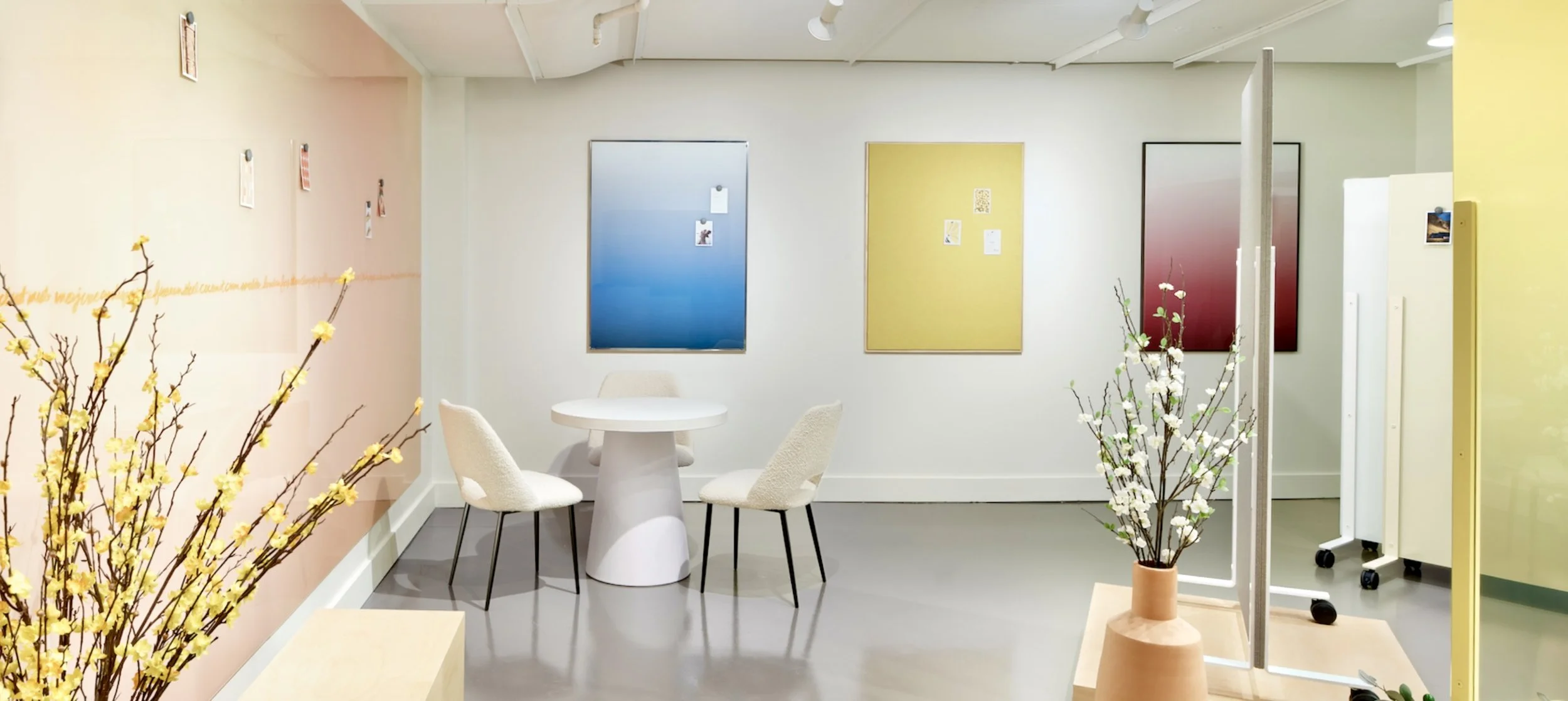
Client: Calyx by ClaridgeYear: 2023Warm tones of terracotta and lemon pair with deep blues and rich woods to create an inviting collaborative space that will inspire you to unleash your greatest ideas on the art of writing surfaces.
The Challenge:
Design a warm, inviting showroom for the Calyx by Claridge brand at NeoCon incorporating new products: Ombria printed glass, Mina Collection, and Ravina wall boards.
Defining the Brand:
Backed by a 75-year history of crafting the world’s finest writing surfaces and working in tandem with Claridge general building and renovation solutions, Calyx by Claridge is a new brand for a new era. Offering curated collections for commercial interiors, Calyx by Claridge fosters collaboration, stimulates creativity, and empowers people to reach their full potential.
Defining the Space:
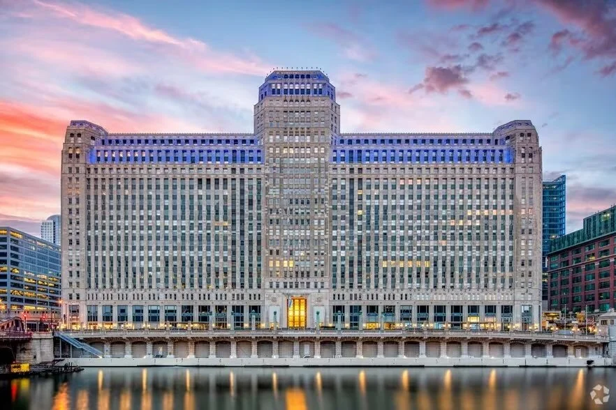
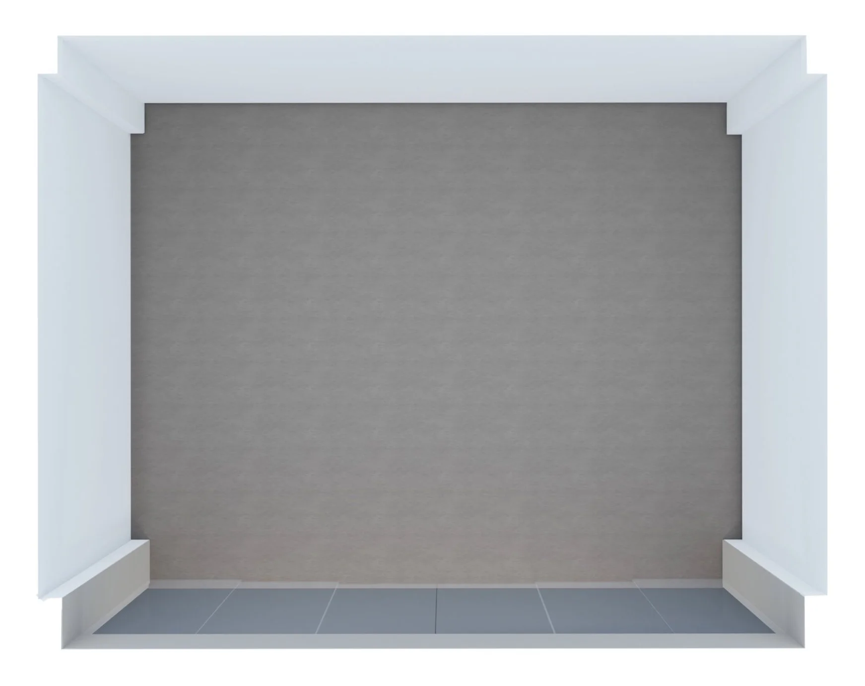
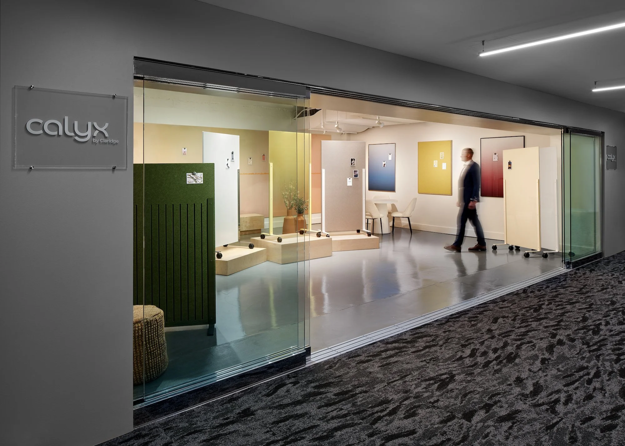
In order to ensure a precise design, I carefully studied the location and space. The showroom was at the Mart in Chicago, measuring 26 feet by 23 feet. It had interior columns at each corner, and the front of the showroom was entirely open with sliding glass doors.
Initial Concept:
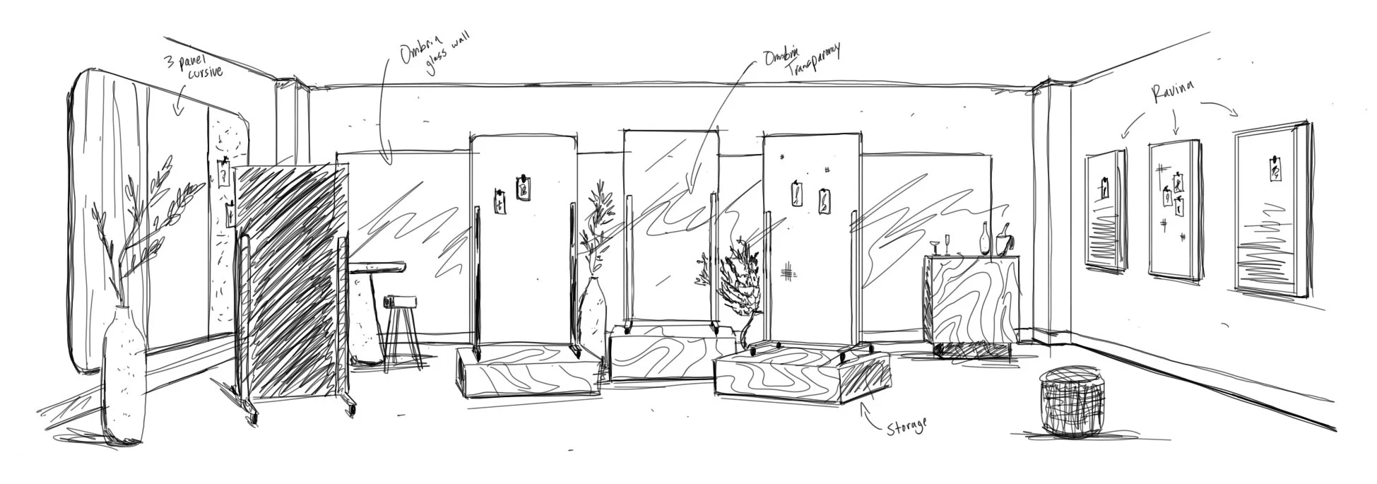
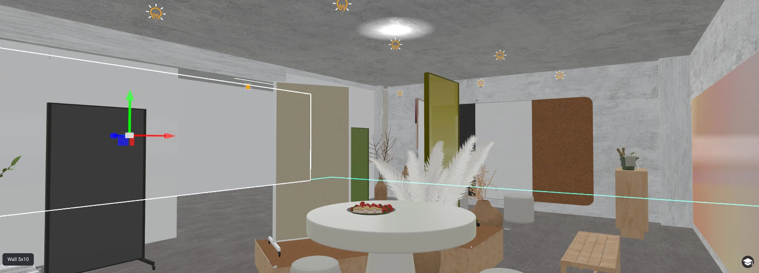
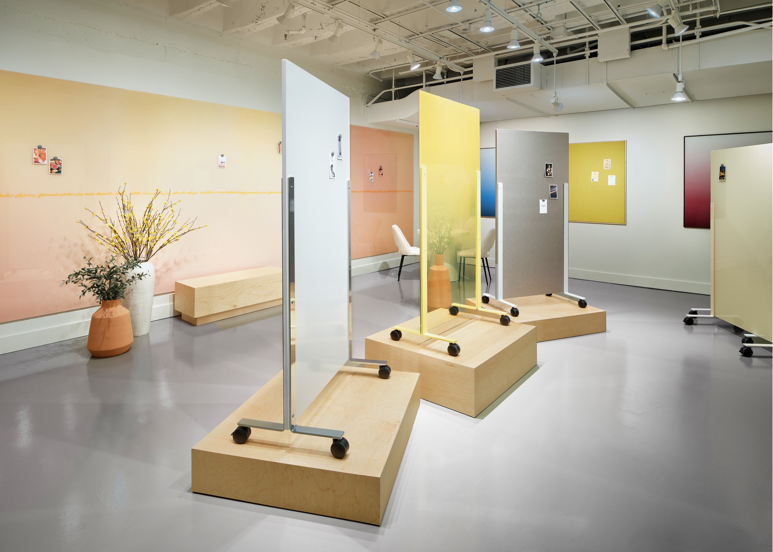
To begin the process, I knew with Mina being the most important new product, it should be the star of the showroom. Knowing there would also be limited space, I designed some pedestals to serve as both a way to elevate the mobiles while also creating hidden storage. With mobiles in the center, the second most important area of focus would be the back wall. Since Ombria embraces art, I concepted a wall-to-wall glass panel of a custom Ombria to emphasize its artistic appearance. I still needed to showcase Ravina, a new framed wall board being introduced which I thought would be perfect for the right wall to help break up the massive back wall. For the left wall, I was considering a large 3 panel board with different surfaces such as tack, glass, and LCS Porcelain. We also needed a bar and seating, so I designed a bar for the right side to complement the pedestals and envisioned some modern bar seating for the left side.
Draft 1:
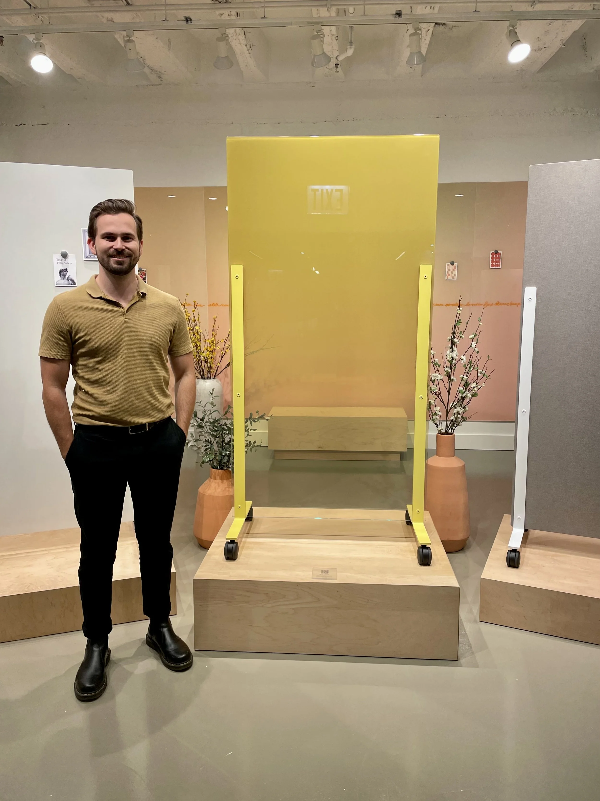
For the first 3d model of the showroom, I added in everything from the sketch and started applying colors and finishes. To create a warm and inviting showroom, I explored yellow and orange tones. I chose a yellow gradient for the middle Mina and a custom peach back wall so that they blend well together. To break up the warm tones, I explored having high contrasting colors on the right wall and a black Mina in the front.
Draft 2:
For the second version of the 3d model, I explored different surfaces with the large panel on the left wall, incorporating some warm tones and removing the total solid green because I felt something that large may compete with the back wall. I then brought in a green Mina Space creator which did not feel as overwhelming as the wall before, yet helped create a grounded appearance to balance out all of the lighter tones.
Designing the Furniture:
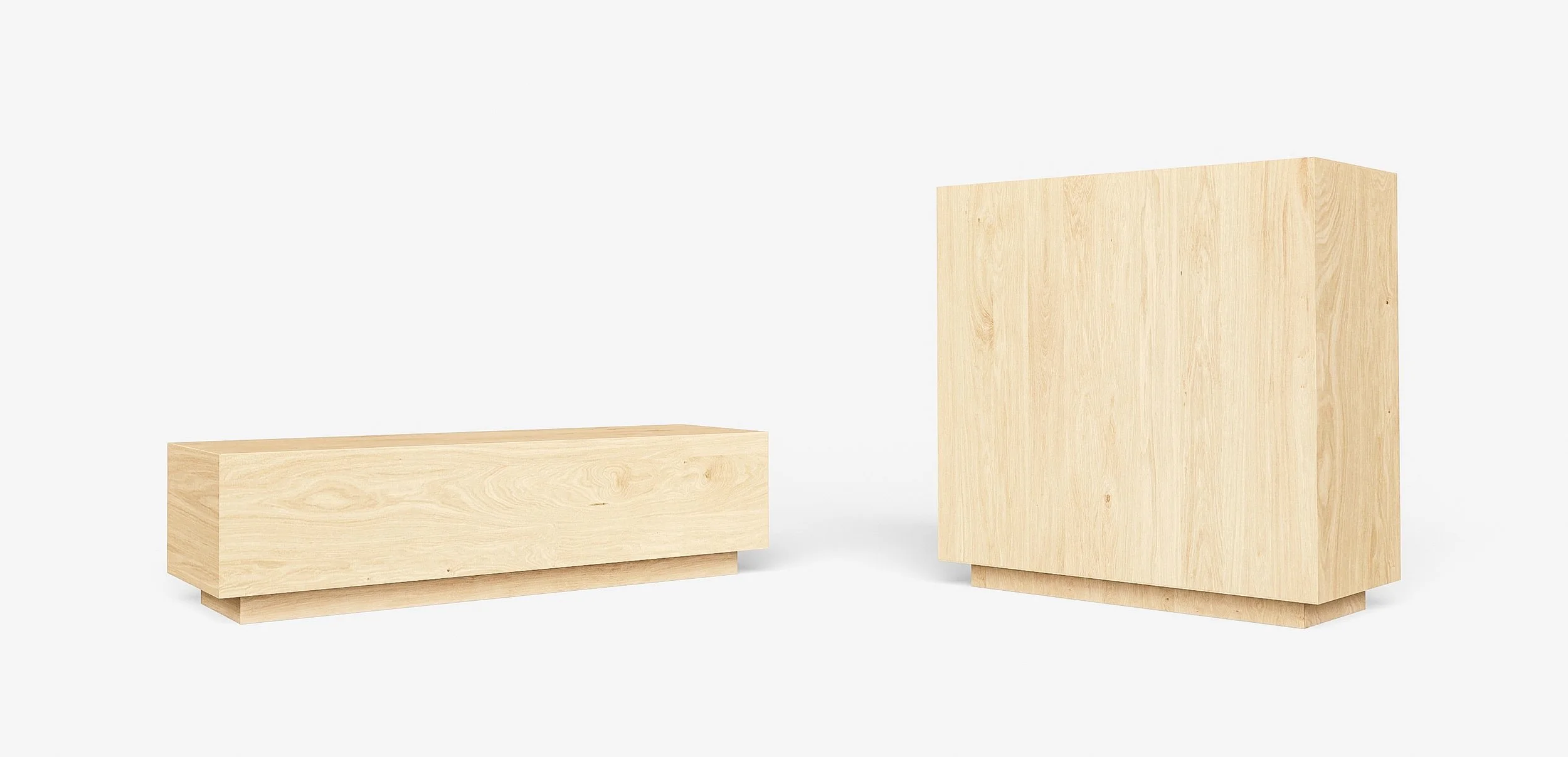
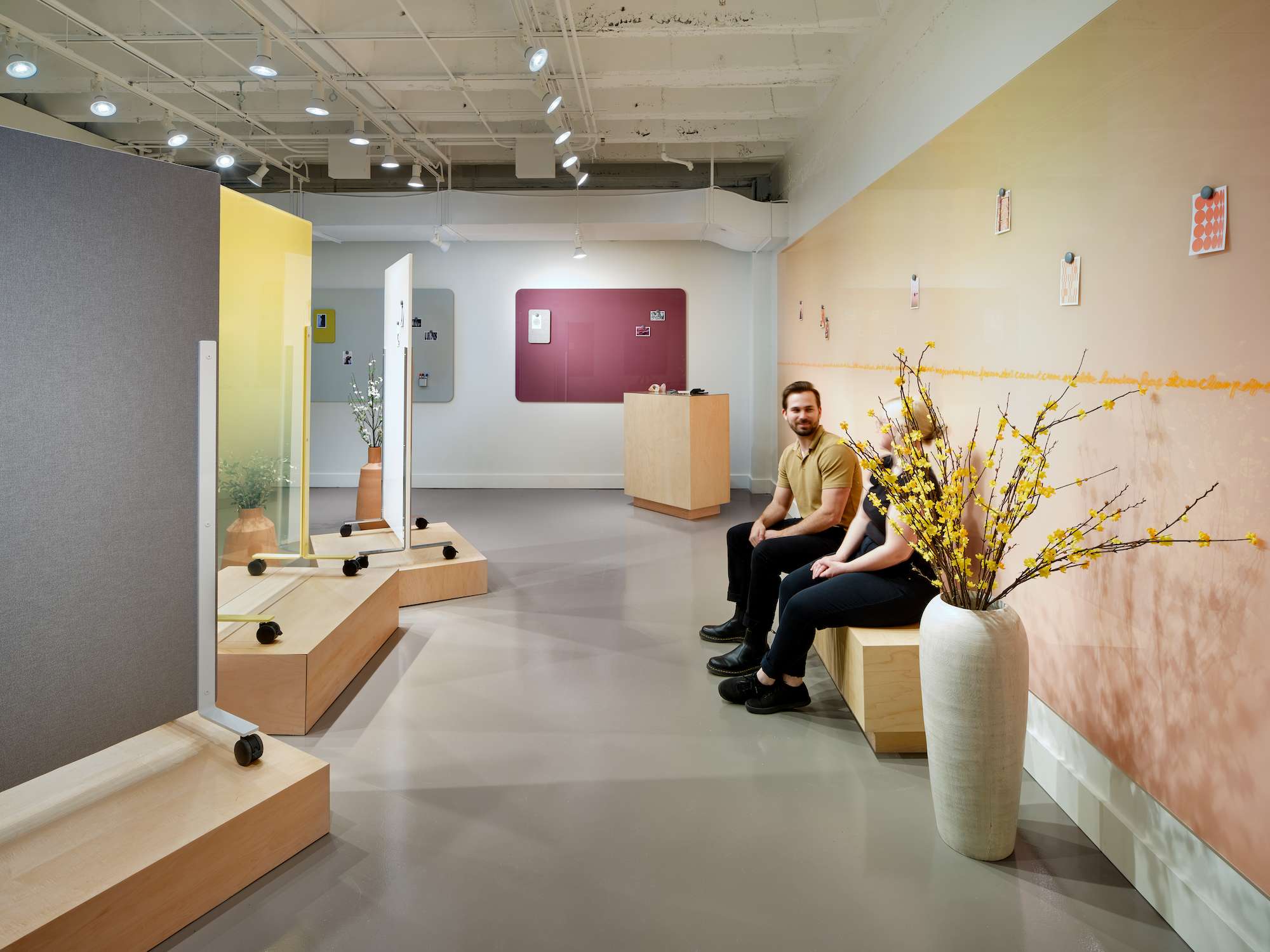
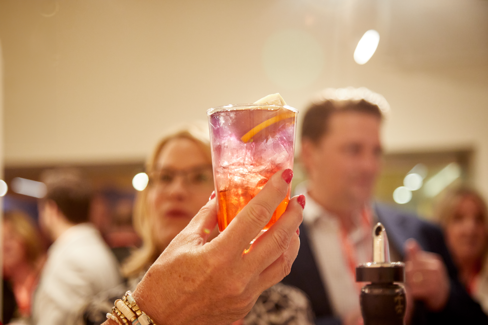
One of the requests for the showroom was to have a bar for serving drinks at cocktail hour. Due to the minimalist nature of marker boards, I did not want to bring in furniture that would pull in too much attention, so I delibretly designed the bar and a complementing bench to have a subdued appearance. The purpose of the bench was serve as a place to stop and reflect while walking through the showroom similar to how one would in a museum. I specifically placed it behind the Mina so one could sit and see the effect of the gradation from solid to clear.
Props:
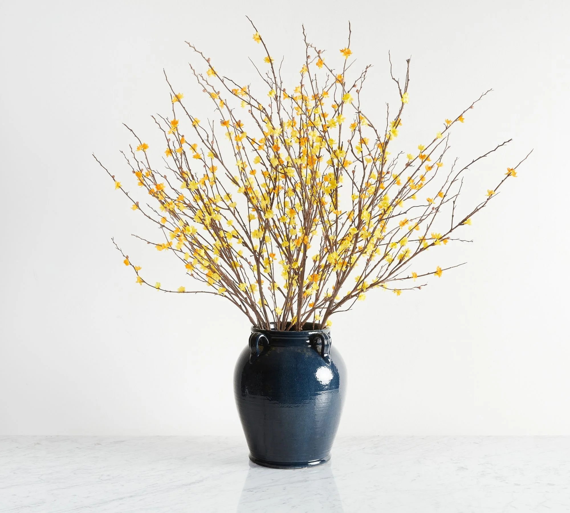
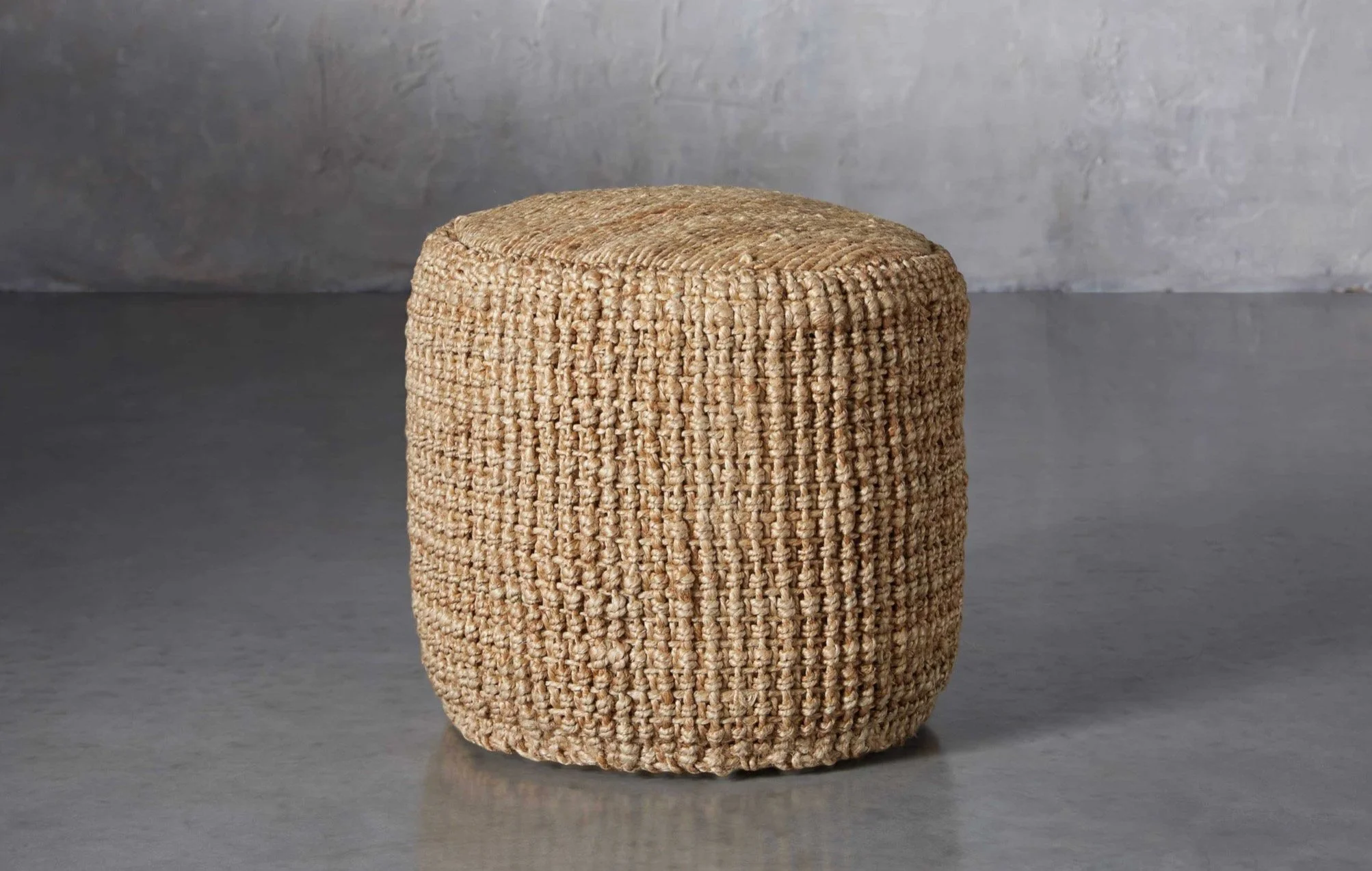
For props, I wanted to ensure every detail evoked a warm, inviting appearance, so I chose organic materials such as stone, terracotta, and jute while selecting high quality faux flowers to complement the Calyx tag line, “Where ideas are born”.
Final Palette:
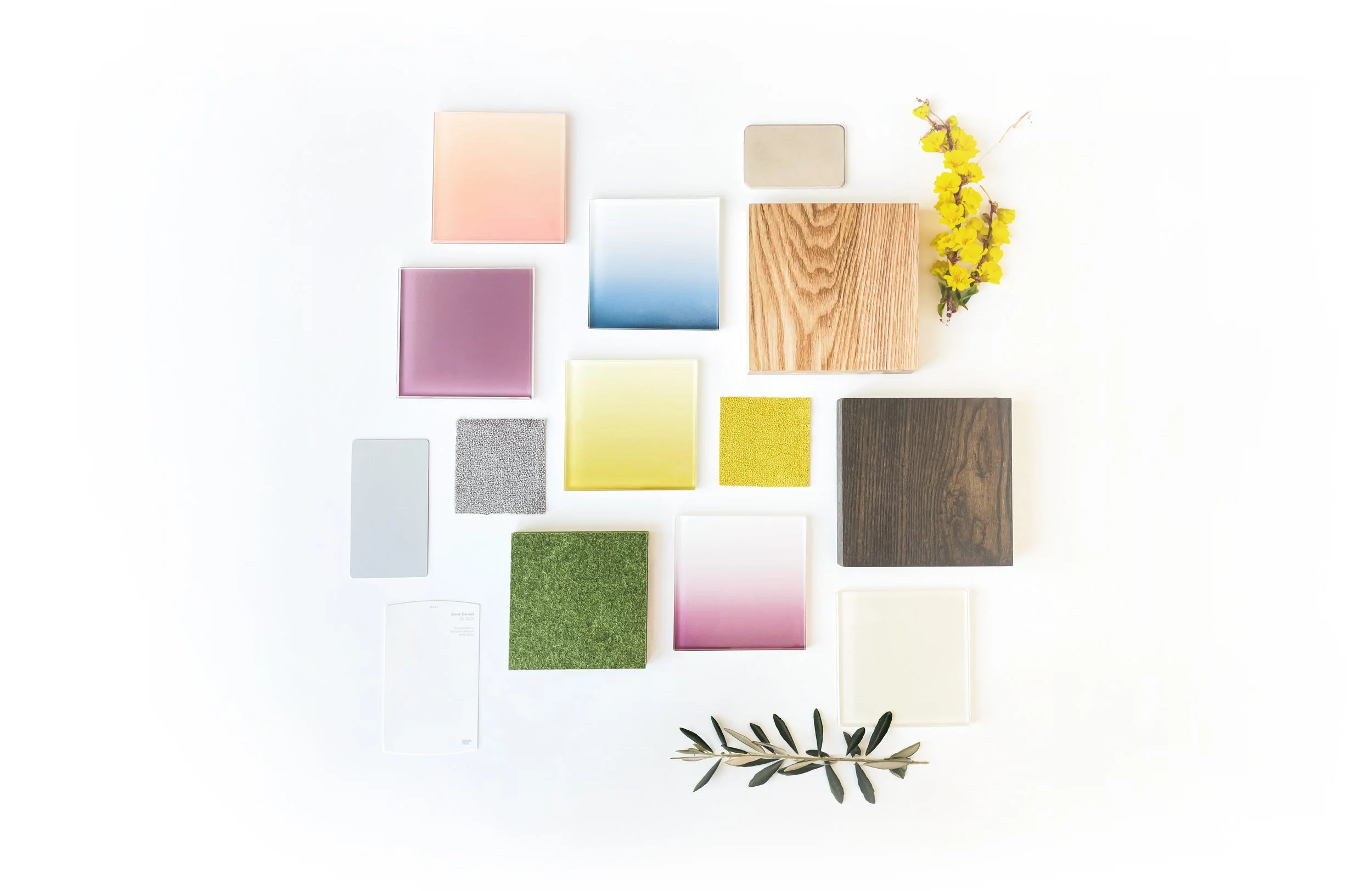
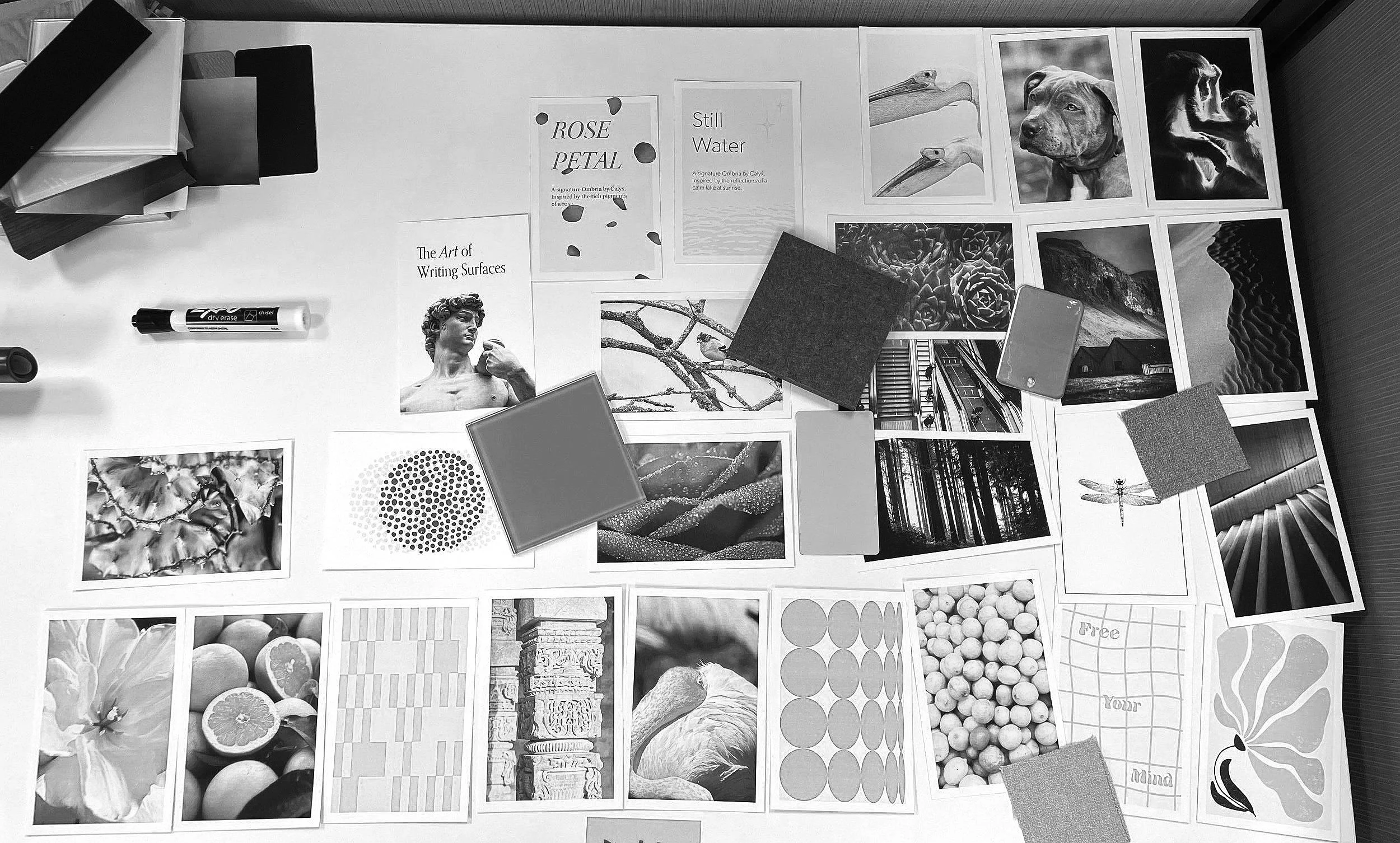
To ensure the colors and materials all worked well together, I created a final materials board to see everything together. Although warm tones such as yellow, peach and plum are the focal point the small hints of blue, olive, and dark oak evoke a grounded appearance creating a balance with the lighter, warmer tones.
Final Rendering:
The final rendering showcases all the materials above and how they will look in context. I removed the black mobile as it was too dark and high of contrast to work with the palette and also one with to marker boards on the left wall instead of the large tri-panel wall. Although much simpler, the two boards added a lightness to the showroom that didn’t steal the show but carried the palette in a minimalistic sense.
Staging:
The final step of designing the showroom was staging the boards to break up the large solid colors. I chose images and created graphics that were warm, inspiring and colorful to create a story for each board. For example, one could look at the peach colored back wall and be reminded of the colorful gradations in a flower like shown below.
